Peer into the mind of a type designer
The making of Peasy: A case study
On becoming a type designer
As a kid, I remember first getting interested in typography when I got my first computer, a Mac Plus, in eighth grade. Many happy hours were spent in Hypercard and Aldus PageMaker as I made interactive slideshows and newsletters. I remember poring over the Adobe Font & Function magazine and begging my parents for the first release of Myriad, a Multiple Master font that came on multiple 3.5 inch diskettes. It was just so cool that you could dial a single font to any weight or width you needed for your design — that was the future!

I even had an early copy of Fontographer, though the horrible fonts I made as a teenager are thankfully gone now. After a career spent in many different types of design — motion graphics, product design, web design, branding, and exhibit design — I decided to try my hand at type design. In 2017, I joined the Type@Cooper West Extended program (now Type West), and I spent a year learning the ins and outs of type design theory, history, and practice.
When I decided to apply to type school, I was honestly worried that the act of moving points around the screen would feel tedious, and this thing I loved, type, would become tiresome. Thankfully, for me, the act of designing type is seriously Type 1 fun on the fun scale — super fun while you’re in the act of doing it. It keeps you wanting to come back for more. I had put type design away in 2020 when the pandemic hit, and when I reopened my font design software earlier this year (I use Glyphs), I was struck by how calming and meditative it is to get lost in type design. I highly recommend it.
The making of Peasy: original inspirations
This month I launched my first typeface, hopefully the first of many. It’s called Peasy, and it’s a low-contrast humanist sans type family that works well for setting long-form text. Peasy was my thesis project from my type program, and to be honest, the name came first.
The project started with a few original inspirations — one was making something “easy” — clean, easy-going, a font I would want to use myself. Another was the idea of modular, multi-color type. Here I explored ideas for stencil and multiple stroke inline styles.
Some drawings I made called for wide base forms that could serve as a skeleton for supporting a multi-line display style. This led to humanist shapes and angles, notch shapes, and low contrast between the thin and thick parts of the letterforms. The multi-line winding shapes ended up resembling the angled stroke of a broad-nib pen and lended itself to flared corner details.

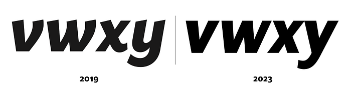
Halfway through the program, the design ended up quite wide, since I was trying to accommodate a multi-line engraved style. Wide styles aren’t super practical for most applications and are rarely used in text settings. The place you find bold, extended width type most reliably is in decals: on kitchen appliances or the backs of cars.

By the end of my degree program, I had a light and heavy roman style, a light italic style, plus a stencil display concept that I’d like to return to at some point. For my presentation, I applied these styles to a fictional airline. Later, after graduating, I spent a few weeks on a heavy italic style to round out the masters, then took a break.


Back from the pandemic
Having put Peasy away for almost three years, I saw so many things I wanted to fix when I opened it back up. I wanted to make Peasy a typeface I’d be happy to use to set text, a face that looks great at text sizes and is highly readable. So much of readability is about spacing, achieving even color between the positive and negative shapes, including the white space between letters. My type teacher Frank Grießhammer would say that as long as even ugly letterforms are spaced well, you can read anything.
My focus was on making the type narrower in proportion overall, with more tightly set side bearings. I simplified the italics by removing the exit strokes that felt extraneous and led to worse spacing. I ironed out odd flares and pinched corners. In general I also worked on improving the drawing of the shapes and corrected inconsistencies and dark spots in the light and heavy weights.
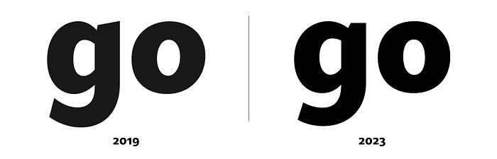
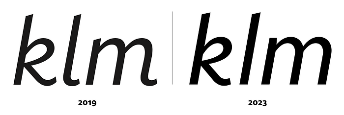
A big part of the refinement was figuring out the contrast between thins and thicks, trying to make the contrast angle as consistent as possible, and walking the tight rope of just how much contrast to introduce.
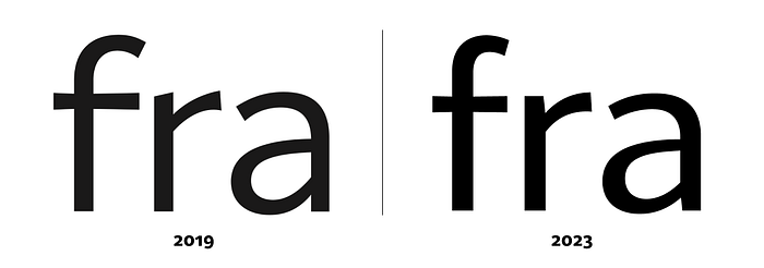
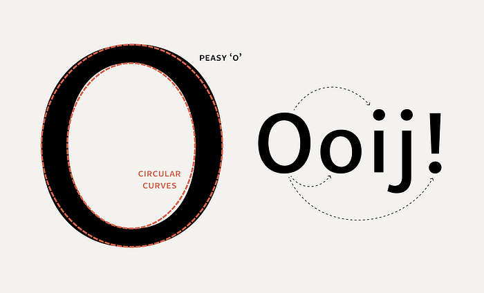
I wanted Peasy to feel relaxed and organic, not fussy or contrived, so I also worked on the curvature and angle of ending strokes, having the cut angle following the curve. The rounds are a little off from perfect circles, and these curves appear in the dots on the i and j and in the punctuation, too.
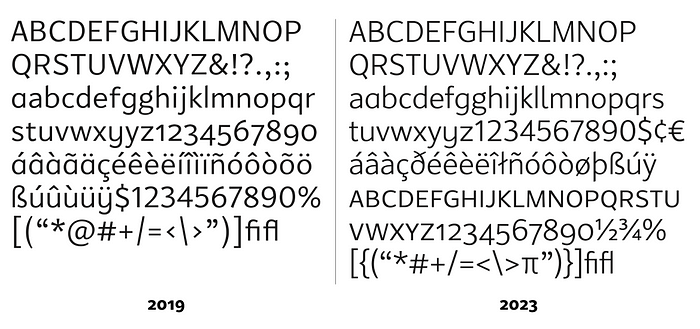
A lot of time was spent expanding the character set quite a bit. I got into diacritics I had never even seen before and learned a lot in the process. Peasy got a set of small caps (a personal favorite), fractions, and both old style and lining figures. I also added alternate forms, some with a more primary school vibe — a, l, and y — as well as a two-story g for more formal text settings.
Launching a font
In a feedback session on Peasy where he gave me advice on the design, David Jonathan Ross said, this is all “type designer shit,” meaning the details we were discussing were things only other type designers would really notice. He said that getting people to use the font would teach you way more than perfecting the curves. His advice helped me gain the confidence to go ahead and release the typeface and see what people make with it.
A typeface design is thousands of micro decisions crossed with thousands of macro decisions, at a thousand different dimensions. At some point you have decide, it’s ready to ship, and you hope it connects with an audience, and they make things with it that surprise you. I’m hoping these reflections give you more insight into the thought process of a type designer. If you’re curious to learn more about Peasy or see it action, check it out at my site typotopo.com. You can also download test fonts to try Peasy out for free.
Also feel free to send me any feedback on Peasy and what you might like to see in a v2. I’ve started to think about how I’d like to expand the type family over time.